First of all, I am so sorry for not
blogging last week! I thought that my progress wasn’t worth
reporting, so I didn’t write a blog entry about it, but after the
positive feedback I got from the class about some of my design ideas,
I thought it might be a good idea to include a progress report as a
preface to this week’s blog. I decided to focus on the idea of
making the invisible visible for my project. Last week I came up
with a slogan that encourages people to appreciate the current air
quality and to subtly remind them of how awful inversions are: “Have
you appreciated the air yet today?” It might be cool to put a few
different stickers of this in different places around campus. I also
came up with a "would you rather" question: “Would you rather: Have nosebleeds for a
month out of every year, or not be able to use your car to drive to
the U?” The sticker might even have a place to check one or the other. I saw a neat type of sticker that changed as people stepped on it, so maybe it would be cool to use something like that. I like this one, but it didn’t get such a good reaction
as I’d hoped because apparently the nosebleed thing is more
uncommon than I thought. My last sticker idea was an infographic
showing the world, and showing how much area all the people in the
world take up versus all the cars in the world (If you were
wondering, people take up an area approximately equal to the size of
California, Oregon, Washington, Idaho, Utah, and Arizona. Cars take
up an area equal to the size of the entire United States of America
including Alaska, Mexico, and Central America.) I planned to show
this on a picture of the globe showing North America, with a slogan
at the top saying something like: “People don’t take up that much
space... But cars do.” I think the slogan needs refining, but I
haven’t had any epiphanies yet on how to make it sound better. I like the idea of the infographic, but I need my roommate's help to get it on the computer.
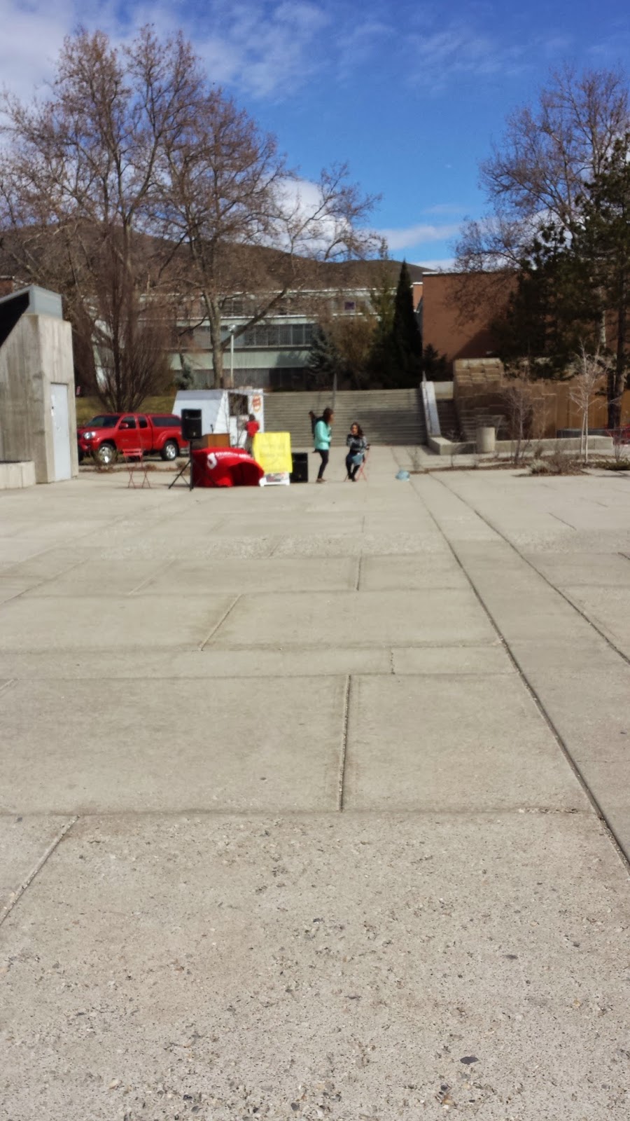
This week, the kiosk group project I
have been working on has been moving along. We experienced more
setbacks than I would have liked this week. The modeling process
gave us a good idea of how the structure we plan to build will
actually look, but I feel that it is moving too slowly, and we should
be focusing on other avenues of this project as well like introducing
the idea to university officials and coming up with purposes for the
project, like advancing the clip idea. My individual project, sadly,
did not get worked on hardly at all in the past week because I was
overwhelmed by my workload. I did more brainstorming based on the
positive responses of the class to my design ideas, and I came up
with another possible infographic that translates the amount of space
roads take up into something that people actually care about. I
haven’t actually done these calculations, but the design might look
something like: If we used half the space in the U.S. That is
currently dedicated to roads as farmland instead, it could grow
enough food to feed the states of California and Nevada. Or
something like that. The numbers are probably less impressive than I
am thinking they are, but I don’t know yet. Hopefully, since I
will be less busy next week, I will actually have the time to make
these into computer drawings. I have also decided to make a class
website, and I have made some progress with that exploring different
sites. Again, I will hopefully have more time this weekend to
dedicate to making the website. Also, I loved the documentary we
watched in class last week.
"The Shore"
was an interesting narrative of collaboration. People with a common
interest were threatened with a prison in their neighborhood, and
they responded to the threat by fighting. Then, they used the
momentum they had to make positive and needed changes to their lives
while still retaining their sense of identity and purpose. I don't
know how to do that, because the projects we have started haven't
been catalyzed by a large change or threat to how things are; our
desire to change things was caused simply by the awakening of our own
self-awareness and situation. Maybe that will be enough to ensure
lasting change, and maybe it won't, but the motives of the Shore
community and our PRAXIS lab are similar enough that watching the
documentary made me feel more confident in our small projects that I
otherwise would have been. It was such an inspiring story, I can't wait until I have time to work on my own designs with the same dedication.