For the past few weeks I have felt the center of the University of Utah shift because of the warm weather and because of the new student life center. It feels like the center was at the Union before, but now it seems like if I were to randomly run into someone it would be at the student life center. I guess it's a bit too late to change the venue now, and that's okay, but this week I have been surprised at how much I find myself gravitating toward the SLC. On the other hand, ASUU elections are going on, and people are campaigning all over campus. It's become clear that having a social gathering space in the Marriott Plaza is still important. I think the reason all these groups choose to base their outreach at the Marriott Plaza is because of the performing capacity of the library as a social and academic hub. If we could find some way to bring the blooming social space inside the library into the plaza, I think we would achieve our goal. I hate to forget that there are other locations on campus that could impact people in a totally new way. What we are trying to do in Marriott Plaza is extend the social spaces that bubble at its edges, like the library and the union. However, places on upper campus remain unused and neglected because normal commuter students have no reason to go up there. As a resident, I understand that great things could happen when classes and residential settings start to mix, but I also understand that there is nothing to draw people to upper campus. I would say that it's an underutilized space, but I think the university will probably expand its teaching buildings up there in the next ten years or so. That makes me sad, because almost certainly it will be disruptive to the natural and historic beauty that exists in the area. I wish there was a way to incorporate learning into the existing structure of Officer's circle and the PHC area. But yeah, that's all far fetched stuff that isn't really important to the project.
Tuesday, March 3, 2015

Friday, February 27, 2015
More Kiosk Examples in the Plaza
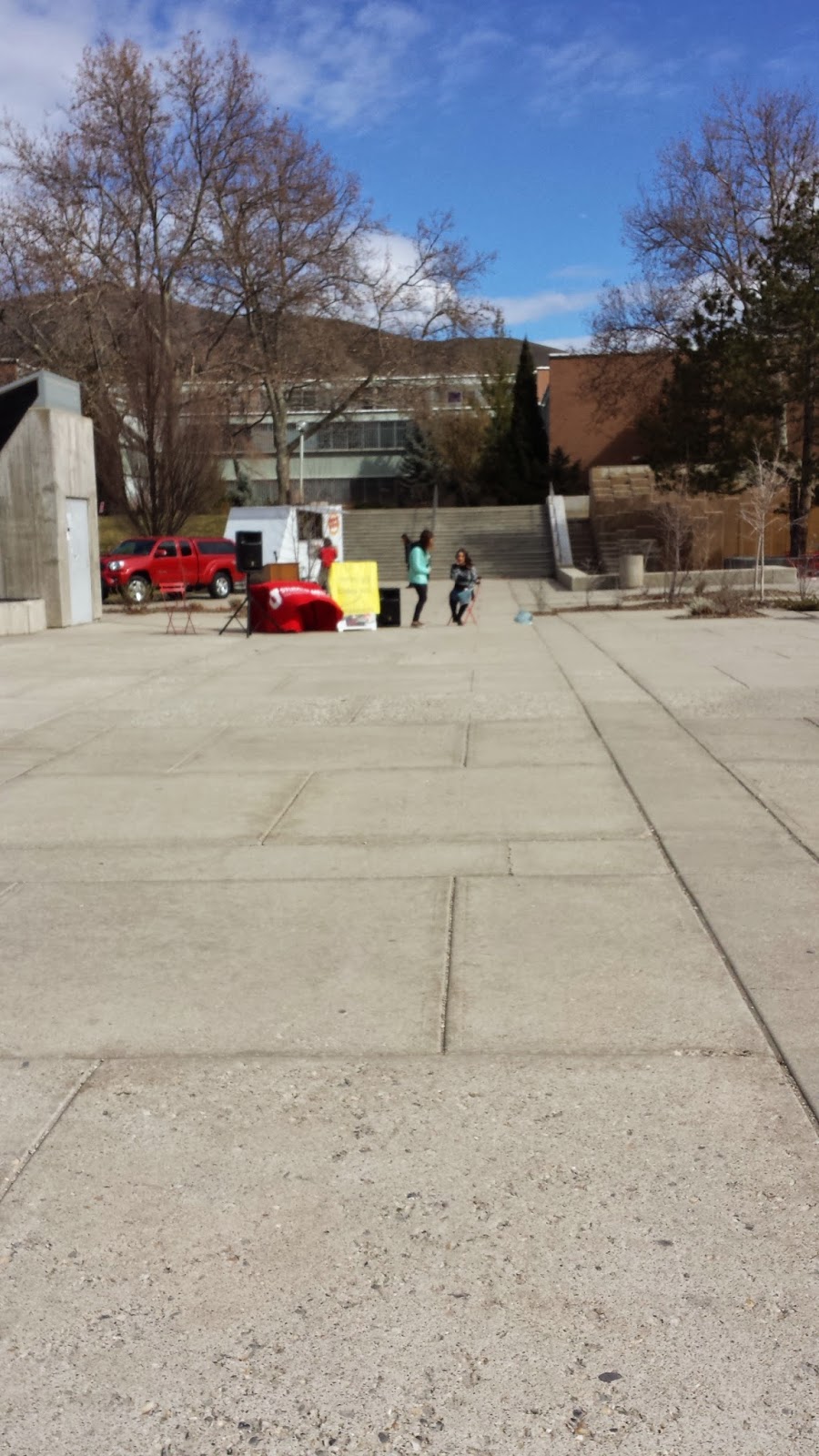
This is another picture of Marriott Plaza. Again, people have a table set up in about the same spot, and they have a sign that says "COME SAY something NICE..... anything NICE!" They also have a table with a microphone that is hooked up to speakers. When I passed by they were playing music for the whole plaza, but presumably I could have gone up and announced something to the whole plaza, but also I would have had to interrupt the music, which didn't strike me as something cool. Again, it felt a little awkward to be prompted to announce yourself to a group of people who don't really know you, and some people who can't even see you. It would be great for us to have something like this, but only if we could really push that casual "it's okay to express yourself, people want to hear it, it's not weird" vibe. I might have been coerced into announcing something if my friends had been there, but I don't care about expressing myself to people who don't care about me unless it's in a much more anonymous setting. I have no motive, even with a pushy "let's make the world a happier place one phrase at a time" prompt. I don't want to expose myself, and that's pretty much what being in the middle of this plaza means. Exposure. Maybe the kiosk would make a good environment for people to gather and help them to not feel so exposed. I think having a roof would definitely further this purpose, so I'm glad that's included in the design plans thus far.
Tuesday, February 24, 2015
Kiosk Example in the Plaza

This is a picture of the Marriott Plaza. People have set up a couch and taken some tables and chairs and are making their own "kiosk." I think this is such a clear precedent for what we are trying to do, people have already set up their own temporary kiosks. It shows that there is an actual want on campus for this sort of space. I want our kiosk to be comfortable like that.
Progress Update
Mostly this past week I have tried to work on updating the website. After class I played around with different sites/themes, and I finally decided on the one I wanted to put up. I didn't receive many emails to add to the editing list, but maybe that will change once things get more detailed. So far I have added a page for Ashley to work with, and a page for Kendra to work on, plus a separate kiosk page in case she wanted a page for her own project.
I also worked on my individual project, I created a graphic that I could possibly use, but I need to study some color theory to make it look good. I also think that I should probably outline all of upper Canada (that's right, all the teeny tiny islands) with black. But I don't really want to do that for obvious reasons, so if there is some solution I can come up with in my color scheme that solves that problem, I'll be home free. The work I did on this this week was me finding a picture of North America that I liked (which was actually pretty challenging, let me tell you) and learning how to use the photo editor I am working with. Once I found this one I actually had to reconfigure some of my numbers so that the areas would all be contained on here. I am also planning on working on putting numbers on here in a readable format, but I'm still working on where to put them... So yeah, that's this week! =D

I also worked on my individual project, I created a graphic that I could possibly use, but I need to study some color theory to make it look good. I also think that I should probably outline all of upper Canada (that's right, all the teeny tiny islands) with black. But I don't really want to do that for obvious reasons, so if there is some solution I can come up with in my color scheme that solves that problem, I'll be home free. The work I did on this this week was me finding a picture of North America that I liked (which was actually pretty challenging, let me tell you) and learning how to use the photo editor I am working with. Once I found this one I actually had to reconfigure some of my numbers so that the areas would all be contained on here. I am also planning on working on putting numbers on here in a readable format, but I'm still working on where to put them... So yeah, that's this week! =D
Tuesday, February 17, 2015
Progress Report and Response to "The Shore"
First of all, I am so sorry for not
blogging last week! I thought that my progress wasn’t worth
reporting, so I didn’t write a blog entry about it, but after the
positive feedback I got from the class about some of my design ideas,
I thought it might be a good idea to include a progress report as a
preface to this week’s blog. I decided to focus on the idea of
making the invisible visible for my project. Last week I came up
with a slogan that encourages people to appreciate the current air
quality and to subtly remind them of how awful inversions are: “Have
you appreciated the air yet today?” It might be cool to put a few
different stickers of this in different places around campus. I also
came up with a "would you rather" question: “Would you rather: Have nosebleeds for a
month out of every year, or not be able to use your car to drive to
the U?” The sticker might even have a place to check one or the other. I saw a neat type of sticker that changed as people stepped on it, so maybe it would be cool to use something like that. I like this one, but it didn’t get such a good reaction
as I’d hoped because apparently the nosebleed thing is more
uncommon than I thought. My last sticker idea was an infographic
showing the world, and showing how much area all the people in the
world take up versus all the cars in the world (If you were
wondering, people take up an area approximately equal to the size of
California, Oregon, Washington, Idaho, Utah, and Arizona. Cars take
up an area equal to the size of the entire United States of America
including Alaska, Mexico, and Central America.) I planned to show
this on a picture of the globe showing North America, with a slogan
at the top saying something like: “People don’t take up that much
space... But cars do.” I think the slogan needs refining, but I
haven’t had any epiphanies yet on how to make it sound better. I like the idea of the infographic, but I need my roommate's help to get it on the computer.
This week, the kiosk group project I
have been working on has been moving along. We experienced more
setbacks than I would have liked this week. The modeling process
gave us a good idea of how the structure we plan to build will
actually look, but I feel that it is moving too slowly, and we should
be focusing on other avenues of this project as well like introducing
the idea to university officials and coming up with purposes for the
project, like advancing the clip idea. My individual project, sadly,
did not get worked on hardly at all in the past week because I was
overwhelmed by my workload. I did more brainstorming based on the
positive responses of the class to my design ideas, and I came up
with another possible infographic that translates the amount of space
roads take up into something that people actually care about. I
haven’t actually done these calculations, but the design might look
something like: If we used half the space in the U.S. That is
currently dedicated to roads as farmland instead, it could grow
enough food to feed the states of California and Nevada. Or
something like that. The numbers are probably less impressive than I
am thinking they are, but I don’t know yet. Hopefully, since I
will be less busy next week, I will actually have the time to make
these into computer drawings. I have also decided to make a class
website, and I have made some progress with that exploring different
sites. Again, I will hopefully have more time this weekend to
dedicate to making the website. Also, I loved the documentary we
watched in class last week.
"The Shore"
was an interesting narrative of collaboration. People with a common
interest were threatened with a prison in their neighborhood, and
they responded to the threat by fighting. Then, they used the
momentum they had to make positive and needed changes to their lives
while still retaining their sense of identity and purpose. I don't
know how to do that, because the projects we have started haven't
been catalyzed by a large change or threat to how things are; our
desire to change things was caused simply by the awakening of our own
self-awareness and situation. Maybe that will be enough to ensure
lasting change, and maybe it won't, but the motives of the Shore
community and our PRAXIS lab are similar enough that watching the
documentary made me feel more confident in our small projects that I
otherwise would have been. It was such an inspiring story, I can't wait until I have time to work on my own designs with the same dedication.
Tuesday, January 27, 2015
Project Responses
For my project, I wanted to change the transportation culture at the U, so this week I looked up precedents to what I am hoping to do. I found this great page that listed cool floor graphics that advertise different things. I've posted some pictures of the coolest ones, and the rest can be found at this link : http://twistedsifter.com/2012/06/funny-creative-floor-sticker-ads/


I thought these were great, creative ways to raise awareness and advertise different things. I don't want to make anyone uncomfortable, but I do like the landmine stickers for their ingenuity and for the physical takeaway in the sticker. I think my biggest challenge with this project will be coming up with a unique idea for something to say. I have a few informal ones, but they haven't solidified enough for me to put them to a proposal, so stay tuned.
I am really excited about everyone else's projects, as well as my own. I can't wait to explore the campus gardens, and I can't wait for the light pollution signs to come out so I can prove to my friends that it's a real issue. One of my friends told me today that he wished there was a grocery store within walking distance of campus. I hope I can change that someday too, because it really would be nice to not live in a food desert. Oh well. Sometime in the future. Speaking of food, I wish there were more fruit trees on campus. I feel like it would be worth it to put together a student group to clean up the fruit trees to be able to have fruit on campus. But I don't really know, it's just a seed idea.
Tuesday, January 20, 2015
Phenomenological Response to '60 Years of Urban Change'
Hey y'all. It's nice to be back blogging again. I've decided to commit to two projects this next semester. The first one I will be doing on my own and the second I will be doing with Kendra, Gi, Corinne, and Maddie. We will be creating a "kiosk" to help make more social and interactive spaces on lower campus. We want the campus to be interesting and exciting and compelling, and we want people to meet each other there. My personal interest in this project is the mission, because I truly feel that campus is sleeping, and if we wake it up so much more of the potential of the university could be reached. My individual project related to the perception of transportation on campus. I plan to create unobtrusive sidewalk graphics that casually point out different, more positive ways to view transportation while de-emphasizing the need for personal vehicles. My main motivation for this project is the air quality and the inefficiency of the way transportation is done in the valley. The commuters to the U are a large part of the Salt Lake City urbanscape, and if the attitude here changes, we might actually have a shot at improving things for the city.
One of the websites we looked at last week in class showed the aerial difference between the structure of cities in the early 1950's as opposed to their modern structures. Here is the website: http://iqc.ou.edu/2014/12/12/60yrsmidwest/
There was an overwhelming trend of urban sprawl throughout all the pictures. The streets got wider, the buildings got bigger. Giant parking lots emerged. For some reason, it looks like God swooped down and tried to put spacers in the cities. I guess this sort of makes sense, because if there are more people you need more space. My issue is that I don't think the space used was efficient. Enlarging the buildings makes sense to me, because if they have a wider base they can be taller and possibly utilize more space. But most of the expansion was done for cars, which is so not okay. Cars are a means to an end. Freeways are an even larger extension of the God-spacers. They take up so much of the area surrounding the city, and unfortunately, the thing they have replaced is the residential areas that used to be near the city. This forces the city to become a place of work, the area away from the city an area for homes, and all of this forces people to rely more and more on cars. Ugh. It's a vicious cycle. I also noticed though, that there is more green space being incorporated into modern cities, which is apparently another form of God spacer. I wish there was some way to make green space that is enjoyable to humans, but that isn't composed solely of grass. The only reason we even have grass is because it grows well in Britain because IT RAINS THERE A LOT... Which it doesn't do here. So, even though it's better than parking lots, grass isn't really the best use of space either. What it comes down to is that we don't need as much space as we give ourselves. In class we referred to it as an epidemic, and I think that's a valid way to describe this trend. The transformation is horrible, and awful, and shocking, and unpleasant, and bad, and appalling, and upsetting, and saddening, and frustrating. There is so much that that space could be used for. =( Arg. Alright, I'm out.
One of the websites we looked at last week in class showed the aerial difference between the structure of cities in the early 1950's as opposed to their modern structures. Here is the website: http://iqc.ou.edu/2014/12/12/60yrsmidwest/
There was an overwhelming trend of urban sprawl throughout all the pictures. The streets got wider, the buildings got bigger. Giant parking lots emerged. For some reason, it looks like God swooped down and tried to put spacers in the cities. I guess this sort of makes sense, because if there are more people you need more space. My issue is that I don't think the space used was efficient. Enlarging the buildings makes sense to me, because if they have a wider base they can be taller and possibly utilize more space. But most of the expansion was done for cars, which is so not okay. Cars are a means to an end. Freeways are an even larger extension of the God-spacers. They take up so much of the area surrounding the city, and unfortunately, the thing they have replaced is the residential areas that used to be near the city. This forces the city to become a place of work, the area away from the city an area for homes, and all of this forces people to rely more and more on cars. Ugh. It's a vicious cycle. I also noticed though, that there is more green space being incorporated into modern cities, which is apparently another form of God spacer. I wish there was some way to make green space that is enjoyable to humans, but that isn't composed solely of grass. The only reason we even have grass is because it grows well in Britain because IT RAINS THERE A LOT... Which it doesn't do here. So, even though it's better than parking lots, grass isn't really the best use of space either. What it comes down to is that we don't need as much space as we give ourselves. In class we referred to it as an epidemic, and I think that's a valid way to describe this trend. The transformation is horrible, and awful, and shocking, and unpleasant, and bad, and appalling, and upsetting, and saddening, and frustrating. There is so much that that space could be used for. =( Arg. Alright, I'm out.
Subscribe to:
Posts (Atom)